the rad reno: living room [before + after]
Today we're excited to share with you the Rad Reno living room! We seriously couldn't have asked for better clients to work with on the renovation of their main living area. In need of an update and a living space that functioned better for their lifestyle, this family of 6 came to us in need of solutions, and fast!
This rad family was looking more specifically for a refreshed look in their family room, dining room, and kitchen. They we're hoping for a lighter neutral palette with a little bit of color. They needed everything to be super durable for their 4 active kidlets, as well as a space they could entertain friends and family while still being functional for their every day life. Functionality was a priority.
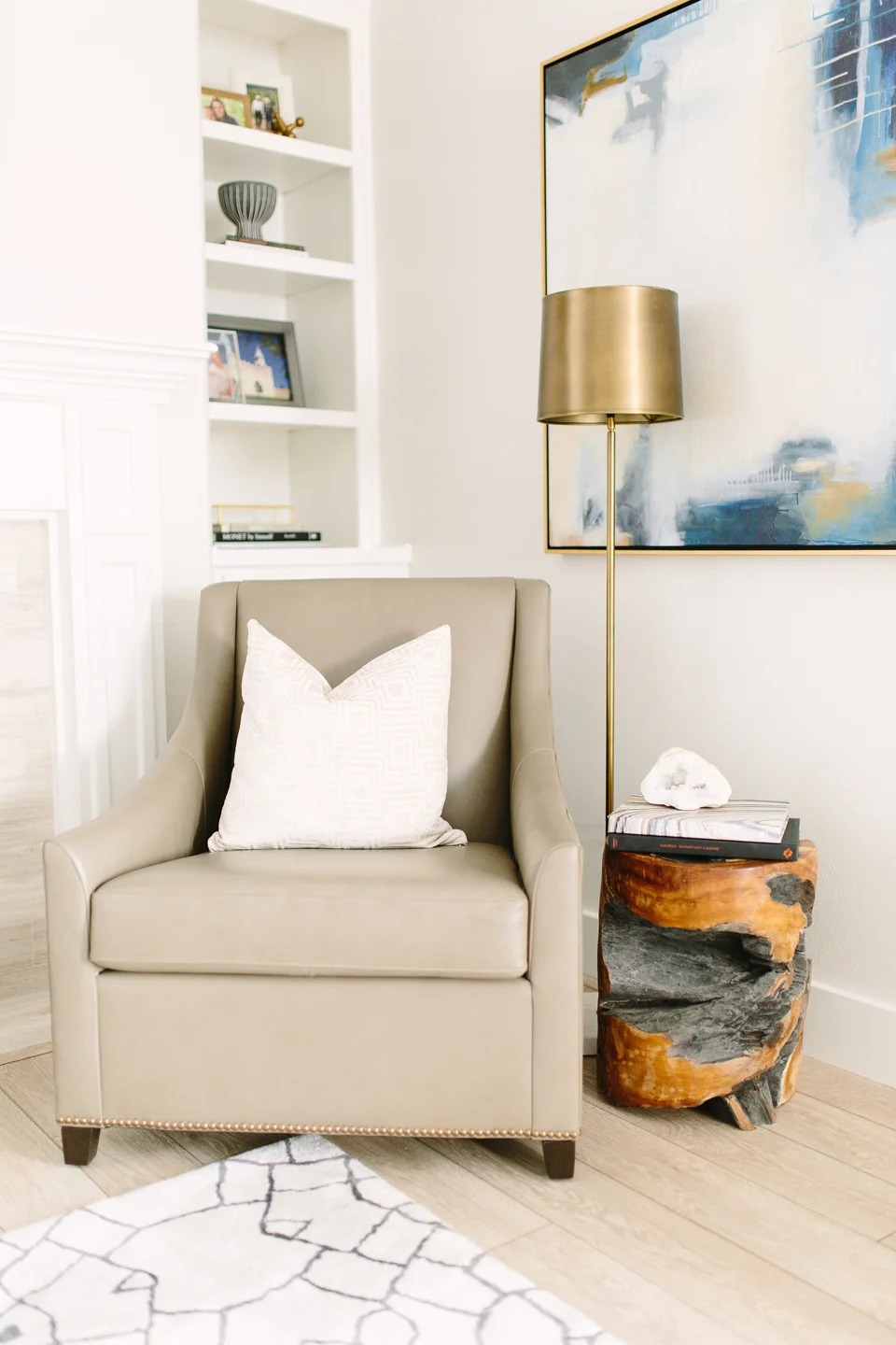
The new and improved light and neutral color palette with warm wood tones and gold accents really made the space feel more energetic and lively - just like their lifestyle. An original feature about this home was a lack of cohesiveness. There were 4-5 different finishes and styles on the trim and built-ins. Every wall felt like it had another personality. A priority for us was to make it cohesive and fluent. We painted all the trim and built-ins the same color and united the color schemes throughout each area.
With proportionate furniture and artwork, the space also felt much larger - like it could hold ten more people! And this little chair moment below... well it became the perfect reading nook for their girls. Who wouldn't want to curl up with a good book in a comfy chair next to the fireplace and an adorable brass shaded lamp?
Now this main living space feels like a breath of fresh air - it's a space you always yearn to come home to. We believe every home should be calling you whenever you're away, a home you are always excited to come back to.
Stay tuned for the kitchen and dining before/after!
Photography by Travis J Photography


