touring the adobe
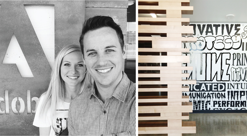
This weekend we had the great opportunity to tour the adobe building which is (literally) right in our backyard. I can't believe we have waited so long to take a peek inside while living so close! It was unreal. To have a such a beautiful building from one of the most respected software companies grace the hillside of Utah Valley is both inspiring and promising. Our tour guide and neighbor informed us that this was a logical location for adobe to plant a seat because a lot of the talent and resources were already located here. I guess it's a pretty great place to live after all.
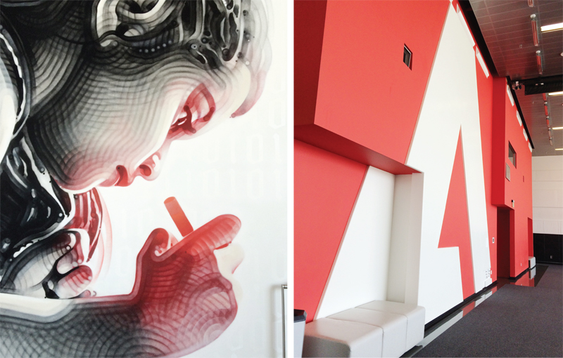
My nerdy design brain was freaking out the entire time. I'm positive our guide must have thought I was taking the oddest pictures. I just couldn't help myself. We were both so inspired by the beautiful architectural lines and details along with the bold graphics and thoughtfulness that went into creating the space. One of my favorite moments was the spray-painted graphic of the little girl. Yes.. it's spray paint, I promise. Ammmmazing right?
Another of my favorite pit-stops along the way was at the restroom. I had a professor in design school tell me once to always check the restrooms for great design moments. Well how about this restroom graphic?! I love her. Everywhere we turned was a typography meets artwork meets design sort of experience.
And the architecture?? If you're going to build a giant building right off of the freeway close to residential areas... well it better be beautiful. This baby does not disappoint. Clean lines, unique materials, and sustainability. What more could you want?
We both left reconsidering our careers and places of work.. just kidding.. but if you're a techy, let's just say this is the place for you. I'm sure of it.


